I believe considering certain problems I have faced in my
personal life, I believe I have done well managing my time, even though at the
start I re-did a lot of my work and this set me back on a lot of time seen as I
didn’t use them in my project. I believe I could have had a better idea on what
I was going into at the beginning so I didn’t complicate my work and do
something I wouldn’t be happy with and then have to begin again. I believe that
even though I kept on re-doing my work it gave me a push to become neater and
do my work slower so it began to come out at a higher standard. After the phase
where I hated my work, I began to like it once I discovered the direction I
wanted to go in and what artists I wanted to use. I feel like I should have
maybe broadened my theme choice better such as using “women” and then I could
have adapted my idea into it and still gotten a similar final piece and design
sheets.
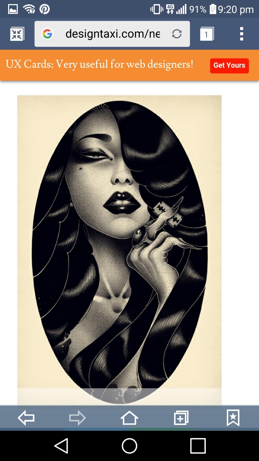
My focus was Pin Ups, I decided on this theme as I love all
things vintage, especially the 40s-50s era, it was similar to the year I chose
in my first year final piece, I didn’t do my best on that final unit but I
wanted to look back into it and create something better. I had also not done
well in my other projects seen as I got a referral for most of them, if not all
of them and I decided to go with something that I know and love and add my own
vision into it. Throughout my project I noticed that there weren’t many
different ethnicities, so I looked a bit further into an artist called ONEQ who
had done Japanese style Pin Ups. I was inspired by this and wanted to do the
same ethnicity but I decided not to and instead I chose to do myself. I
believed this would make use of my primary research and this way if I decide on
a certain pose or position I always had a reference as long as I had a mirror.
For my primary research I decided to dress up in a 50s style
with my hair a particular way. I believe this went well and I really captured
the 50s image. I also edited them to be on a grey scale as well as using a
vintage filter to make it look more like photos from the actual decade. I
believe that my primary research is probably a sturdy foundation of my work and
I have used it to build my ideas up. I also did some drawing from observation
as I thought if I decide to use me as the model for my final piece I should
practice looking at my own features. I did two on one A” sheet. One was of 10
minutes and the other was of around 30 minutes. I believe this helped me not
only get to know my face, but it helped me get a rough idea of how long a good
piece will take at a small size and then it helped me think on a bigger level. I
also decided to do a gridding exercise and this went well for structure but not
so good for detail.
I developed my research by looking on places such as
Pinterest, Google Images, Instagram and, even though it isn’t advised, I used
Wikipedia as they had a list of different Pin Up artists that I could use. Most
of my research on Pin Ups went on my mood boards and alternative and unusual
styles on Pin Up went into my sketchbook as I felt this was more appropriate as
my final idea was piecing together I knew it wasn’t going to look like an
average Pin Up illustration. I wanted realism in my final piece.
I chose to do several Critical studies for this project as
there was more than one artist that stood out to me. One of them was Sasha Ira,
her work wasn’t related to pin up but there were many graphite drawings of
contemporary women and I liked the style and how the flowers in the background
just came together to produce a natural looking composition, this was ideal
considering I had just done a graphite drawing of Hedy Lamarr in my sketchbook.
Another one is Tracy Lewis whose media is water colours and I liked the tones
and the way she used them wisely in certain places as well as being able to
merge the colours. I mainly chose my artists due to their style that I’d like
to take on or interpret my own way. I tried to do my studies in a variety of Medias.
The elements that I took forward in my final design were the
tones from Hsaio-ron Cheng and how they are light but colourful as well as the
positioning of the model. I used the realism from Ira and Alberto Vargas. I
didn’t use anything from my work on Angela Moulton or Tracy Lewis studies.
What influenced my work was the idea that Pin Ups should be
of all races and can be of all races, and by using me with my features that are
different but just as beautiful as any other ethnicity works. I wanted to use
the different tones to show that with certain colours in the background can
match different skin colours really well and give a very pretty pin up look. I
liked the work that Pearl Frush had done and I liked the media and the use of a
canvas and I knew for realism I would be better off using oil on canvas and to
my surprise I was right.
The problems that effected my design was that the gold pen I
wanted to use on my canvas wouldn’t actually draw on my canvas especially over
the oil paint, when I shook it this caused the pen to leak all on my work and
splatter. I managed to use the pen by draining some of it and using the nip to
almost paint it on. I then used the pens fault to create a drip/splash effect
all on my background just so the piece didn’t look ruined or like it was an
accident. Eventually, I managed to make it look good and it actually gave it a
bit of an edgy look which I think looks good and shines well in certain light.
It adds my own touch among ideas interpreted from other artists. Another
problem was that I wanted to do embroidery on my canvas however, using paper
and a particular thick needle showed that the holes would be visible and would
make it look un-neat especially if I didn’t like it there would be the holes
randomly on the canvas.
For my experimentation I looked into all the workshops bar on
being jewellery. I managed to do a Tile in ceramics, Screen print, Lino print,
Embroidery, Pyrography in wood work and Photoshop in Graphics. I liked that I
managed to do more than one type of workshop, it gave me an idea of what I
definitely wanted to do for my final piece and in what media.
The problem solving that I encountered was that when doing my
final piece my gold pen accidently splattered on my canvas and it wasn’t what I
wanted so I decided to shake and put splashes on the background of my work and
this gave it an individual touch so it worked out well. I used a bit of card
after that to draw the ink out and use the nib as a brush and paint it on the
sections I wanted to intentionally put the gold lines. I also encountered the
problem of not having a phone at the end of the project to update my blog so I
decided to come in to college and do it when I had days off and use the
computers. I don’t think I had to solve a lot of problems to get to my final
piece as I had a clear idea of what I was doing from my sketchbook where I
ruled out certain issues and gained my ideas clearly and carefully. I used my
experimentation to find out what would work and how and if it was something
that I wanted, in a way I believe this helped solve my problem of what to do
and if it was possible.
I believe that maybe if I’d have had the time to do
embroidery I would have and I would have picked a good base material, rather
than canvas, to produce it on. I don’t think I would have had the time to
produce neat work for a full final piece. I did however experiment on a dress that
my mum had bought me for this project, we had gone looking in charity shops for
a vintage dress that I could embroider on. I started to do a small section but
as I said it was only an experimentation but it was just to show that I am
trying to develop my idea. I believe I could have done my primary research a
bit better and produced better and more professional images. I could have also
produced something that was at least in the pose like I have done. Because of
this I used an image that I took of myself from a while ago and used it for a
better reference.
I decided on my final design as I felt happy with portraying
myself in my work, at first I was a bit unsure as I didn’t want to exaggerate
my looks in a good way or a bad way. I also used some of the artists that I had
looked at to get ideas, the main artist that influenced my work is Hsaio-ron
Cheng, due to her tones and smooth textured gouache prints, I just used what I
am best at, painting in oils, to get the same kind of quality.
I believe I used my blog effectively and it helped me to
remember pieces of work that I had done when I hadn’t got the work in front of
me. I also used it as a way to do my annotation at home and wait so I could get
to college, print it off and put it to my work.
Altogether, I think this project has been by best out of the
two years and I’m really happy with the results. I hope to continue to get
inspiration from it and maybe in the future begin to sell my work from ideas I
have gathered from this, I could also use the idea methods of the project to
build my ideas before rushing into them. The organization that was needed for
this project was just right for me as I like to be organized however, I found
it hard to meet the amount of work needed as I would get things mixed up and
think I had more artist research sheets and not enough design sheets. I also
found it hard to differentiate Design sheets and final design sheets and why
you would need two rather than one final design sheet? If I were to do it again
I don’t think there’s much that I would do differently apart from use a broader
subject that I could have gone in many different paths and still be on the same
subject. I found it harder with the last few projects but with this one I found
it a lot easier especially with the freedom to explore what you’re capable of.
I would love to use the methods that I have learnt in this course again, for my
own projects if I began selling my art or putting it on display.


