Sunday, 6 March 2016

Old Critical Studies FMP

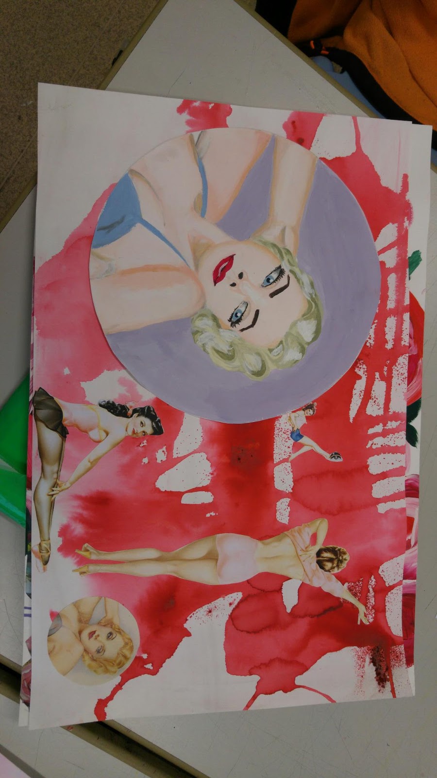
My Roy Best critical study was good but I believe that I could have done better comsidering some of the work has been cut out from another piece of paper and stuck onto a background. I did the Hollywood styled face in acrylic but the background in ink. I also added two photos of some of Bests other works. However, they look very out of place considering they have a background of their own. I think I did them too small also and could have done them a lot bigger to show the small details he has done. I like the background as it is a Georgia O'Keeffe piece but wasn't full enough on the page for me to continue with it so I made it a background for this to solve my probelm of where to put the face cut out. I know I could have been neater on this piece hence why I have made it an old sheet which I am learning to improve from. Now, my new Roy Best critical study is mucb smoother, neater and placement is much better. i do believe I have learned from the mistakes I have done on this sheet.

I dont mind my old Alberto Vargas sheet that I have done However, it could be better put together, with more to fill the page rather than just print outs of his work dotted around. I think I could have added more critical studies to the sheet and worked the print outs better into the page with better placement. I again have cut out my critical study and stuck it onto another sheet to give it a background I think I could have prepared to do a back ground before starting my main piece and It is the same for my Roy Best piece too. In the past I believe this has been the main issue that I have left blank space and made my work look sparse due to this.

My critical study on Angela Moulton is pretty much perfect but I felt like it needed a background, a thick one. The colours are really bright and intense like the original and it's a shame I didnt think about the background before doing the foreground because this would have been perfect. I didnt want to add a background because I like the way that it is and I can now show the smallest, but still useful, development from this one to my latest version.

Another problem with all of these Critical Studies is the fact I have writted the artists name on the front taking up quite some space, that could have been useful for something else. Hence why I cut them out from their original piece of paper. They are all also too small and i wish my work to be the same size and as large and outstanding as they can be. 

Thursday, 3 March 2016

Primary Reasearch FMP


Alberto Vargas Critical Study FMP

Alberto Vargas is a well known pin up artist who helped define the iconic image of pin up art. His work has a unique style which shows soft colours using light tones creating elegance and beauty in the female image, such as the porcelain type skin he uses for many of his models. His illustrations of the female body are much more accurate with the slight lines and creases which women of all sizes naturally have, although Vargas uses slim-build women as his models. Unlike othe pon up artists, Vargas deems to take his illustrative work close to realism with his incredible accuracy of the body and face. His art not only seems to push the boundary of pin u, but the standard of art in the 50s period alone. 
Vargas has created a very realistic piece of a red headed model.  She has a full shaped face and smooth detailed facial features, which are like that of an average woman, however, the smooth and soft looking pocelain skin is quite spot on and the shadowing/tones are perfect due to its simplicity. It seems to be relistic in these aspects, it is one of the best pin up pieces I have seen, hence why I have chosen to recreate it. There is a light glow radiating from just the face of the model and part of the chest throught the skin, using innocence as a key role showing slight cleavage. It is fascinating how Vargas has managed to create such beauty in an illustration and make it look natural. Many of his works are done in water colour and amazingly he manages neat lines, edges, shading and tones in this piece. From this piece I hope to capure the natural beauty Vergas has created. 
I believe my version of this piece takes a very similar shape to the vergas piece. The colours are soft like the original, however the shading is much sharper than the original piece, there could have been a much more smoother and blended style to it by creating shades from the original skin tone. It is quite realistic and correctly coloured. I believe that although the original is water colour I have done well in acrylic. The facial features don't look too rushed like I tend to do and the eyes are almost coreectly sized. The lips are well placed on the face and shaded correctly with nice highlights in two tones. The nose is good and it is one of the best I have done up to this point considering it's size, structure, and placement, I believe in the future I could develop it further by simply sketching to help my portraits be more accurate for my final pieces of work. Moving on to the hair, there isn't much smoothness or fine detail that Vargas shows in his work but the shape is quite similar to the original. I maybe need to work on being able to get small detail using a thinner brush. Maybe next time I could also try using water paints , which aren't my strongest point, to recreate his work, rather than acrylic. 

Monday, 15 February 2016

Project Proposal for FMP

Section 1: 

From the past few projects I have completed within the second year of the course, I feel that I could have done better. The elements which I could improve from is my amount of research, as I seem to work from very little information such as research and then I begin to get stuck when I try to develop my ideas further and also explain them with detail as I have nothing to back them up with as I have not researched in enough depth. My artistic skills have developed steadily but greatly and I have managed to learn new methods and different media which I hadn't used in the previous year such as Gouache, and again most of the mothods I have used have been completely different to what I knew prior to the course in High School. I have learned how to use mixed media and how it can make my art more interesting and unique. Looking at my previous pieces of art in the different workshops, I feel like my strengths are within fine art and textiles, so I decided to choose multi-diciplinary, so I can show my work with a wider range of media and methods to help my work become closer to my design. I hope that my choice of pathways will help me want to be more involved with the project, but at the same time I want to think out side the box hence why I have chosen two to include into my work.

Section 2: 

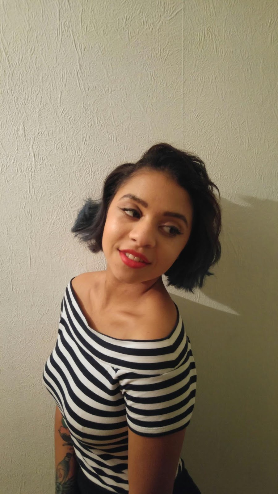
For my project I will be looking at pin up art and illustration, for my primary research I will be taking photgraphs of a chosen model to recreate the poses of the pin up models and also gather an idea of how much effort it would have taken women in the 50s to get ready. I will be looking at books which I have found from the V&A to help my development for my secondary research and the internet where I believe a lot of pin up art is stored due to its rare apprearance and its delicate, original form and not remakes of art inspired by the artists in the pin up period. To help me create original images I may also use magazines like glamour to create new faces of the illustrations I do and produce them in the style of pin up. My title helps explain what element of pin up I shall be developing in my work, 'Pin Ups: The Classic Beauty of Women'. I want to show the beauty of women in my art but through illustration and I have been very inspired by the fashion and life style of the early 20th century period. Mixing these two ideas I believe pin ups is a great way to get closer to my project and feel more inspired to complete it to a high standard. I may also include ICT and try photoshop to edit the photos I will take for my primary research to create my own art from an individual model that will be unique to other artists. I'd like to be able to give the art my touch and give myself a chance to create a beautiful project I can be proud of. Through out the project I will keep my blog up to date to ensure I know what I have done and where I need to develop next, I will also write down ideas that could help with my project and also words that could help me annotate my work in my notebook. All of this will help support my art work and keep everything documented. For my Final major project, which may change as my ideas develop, I may form a collage of pin ups and faces in the style, or I may develop original and several long canvas/boards of pin ups which may link together or could be as unique as the next.

Section 3: 

Through out the project I will update my blog and evaluate how well I believe I've done and what I could have done better, I can also include my problems I have solved though out my project in the blog. Other ways I will evaluate will be through my annotation of each piece of art work, this will be found maily on the back of my work explaining what media I have done, methods I have used, why I had chosen to do it, what went well and what went wrong. This I believe will be useful for me in the future to improve my work by reviewing the things that went wrong and what went well to make my art better each time. I will at the end of my project describe overall how I believe I did and the things I have learnt from the project and how freedom has been for me personally.

Proposed Research: 

My proposed research will be shown through my bibliography that will more than likely be attatched by a seperate pieces of paper as I will be referancing as much of the information I find as possible. I may use magazines also which again will be put down on my bibliography, harvard referanced, and also photographs of some family back in the period which I am looking at ( early 1900s).

Thursday, 4 February 2016

Just a note to readers

Hey,

I know my spelling hasn't been great, mainly because I'm doing all my blogs via phone. However, I also have quite sausage fingers as it seems and mis-type words. I also don't have great sight and tend not to wear my glasses. Lame excuse but bear with me! Ill check through my work as often as I can to correct my mistakes!

Thank you!

Evaluation

For my primary research, I went to my local library in Chapeltown to gather ideas and information. Some of these ideas weren't from the reading boards or their wall designs but from the books themselves. I used their new book stsnd to find books that were new and updated for children to be interested in considering the modern world. I found quite a few interesting ones such as updated illustrations for Enid Blyton books and also colourful and bright DC Comic books such as superman. I looked at these for inspiration surrounding my reading walls. For my secondary research I used websites such as waterstones to gather information on new books and images to gather ideas from. I also used pinterest, which is where I got many of my Amber Goodvin and Anna Bond illustrations from and also my critical study work. I also used Google images to do some of my critical studies.
From my research I began to use different images from pieces of print outs and pictures and placed them together to create a new idea. I also looked at how to make a small image into a big one without it looking too much and creating a central eye capturing image for the children to look to.
The client wanted something within a £100 budget for each area I was to do, the reading boards and Library Wall, this meant my materials had to be short budgeted and come within their price. Considering the price the wasnt much I could do with the wall and boards to the extent I would have hoped. I believe with a bigger budget I could have made something a lit better and included much better materials for the children to notice and be interested in. The reading boards however dod go slightly out of budget but it can be changed considering whether the ideas want to be kept or not. I felt like these ideas were needed to draw the childrens attention and add more learning to them. I also avoided 'Adventure Time' as the client had asked due to its nature and I kept to something more natural and woodland based for the majority of my designs to show growth around reading.
Some of the experiments that I did were creating a cardboard version of the librsry wall to get a better understanding of how it will be set out and where my work will go. I also did some two-point perspective drawing which helped me put things together on bith sides of the wall without it looking odd or out of place.
Some of the designs for the library wall went out of budget so I had to try and keep it within the amount I had to work with. I looked at other places for my equiptment and paint as well as limiting myself to what I needed rather than what i wanted.
I would have used a variety of materials without constraints such as chalk paint and stronger paints that take damage easier.
My illustrators, Goodvin and Bond, worked well with my idea of nature and growth as they were from places like hallmark there was a veriety of subjects and ideas I could gather due to their area of work. Other illustrators in my work I tended to cooy the majority of their style but place it differently and add small touches not to confuse it with someone else or stray from the its actual purpose.
I believe I mabaged my time well considering the time I spent off the project. I did around 6 yime management sheets to get me started and most of them were done a week before I needed to stsrt them so I had a good flow. However, when I began to fall behind on my work I stopped using my time on planning and just got straight on with my work. I believe it was ideal at first but when I needed to catch up it wasnt my best interest.
I believe going first for the presentation to the client snd tutor wss a good idea as I wasny pressured to do it or made to do it, so I felt more incontrol. I didnt feel nervous or worried, I simply produced my designs hoping they were at s good enough standard to be noticed. I felt like it went well but theres always room gor improvement such as eye contact, more preparation and a better presented presentation, which I believe is where I need to improve.
This project was out of my comfort zone and its not something I would do by choice. Personally I believe its helped me realise what I don't want to do in my future, luckily interior design isnt something I have picked to do at University. I believe that it coukd have been more art focused as it was too much design and I felt it side tracked us from the main idea of the course. I dont think its something I'd suggest would work and it is slightly more for those working in textiles which is not my choice of workshop.