Wednesday, 30 March 2016

Sketchbook FMP

Here is some of my sketchbook work, some of these images are developing pieces and others are the finished result. I am quite pround with how I have set this sketchbook out as I have done 3 in total in attempts to make it how I would like it to fit with my project. There are small mood boards within this sketchbook and also design/idea development, it also includes my mind map for my project and where I could gather my ideas from.

Tuesday, 15 March 2016

Flower Embroidery FMP

i enjoyed embroidery as it was quite neat easy work with colourful and great results. It would be nice to do something like this on a self made dress or skirt to show my skills in textiles. I hope to use this in my future work, maybe not for my final project, but to add to the project. It was hard trying to actually thread the thick wool into the needle but eventually I managed it and created the main petals. I then used thin thread to add small pink and green detail. Next time, I could have created a neater result and I believe it wasn't as neat due to experimenting with the wool trying to see which way would create a neater result and covered the same area. From this I managed to find the best option which will be useful to me in the future. 

Experimentation: Pyrography FMP

My pin up Pyrography was fun to create and quite easy to produce. I used a small piece of MDF and burnt on the pencil marks to create the outline. I then used a swirling method to get shading, I could have done better on the parts where I have accidentally used lines to shade and it shows the points where the pyrography has stopped to change direction. I didn’t do the face as there was a lot of detail but I may plan to do a simple face like on tattoo designs. Overall I don't think it’s something I plan to use in my final design, but it might make a great base to some of my work if I were to paint over it. I may be able to make a stamp/print with this too creating neater lines than those on lino and mono print, and I won’t have to free hand it making it easier if I decide to create a repetitive pattern.
way. 

Sunday, 6 March 2016

Old Critical Studies FMP

My Roy Best critical study was good but I believe that I could have done better comsidering some of the work has been cut out from another piece of paper and stuck onto a background. I did the Hollywood styled face in acrylic but the background in ink. I also added two photos of some of Bests other works. However, they look very out of place considering they have a background of their own. I think I did them too small also and could have done them a lot bigger to show the small details he has done. I like the background as it is a Georgia O'Keeffe piece but wasn't full enough on the page for me to continue with it so I made it a background for this to solve my probelm of where to put the face cut out. I know I could have been neater on this piece hence why I have made it an old sheet which I am learning to improve from. Now, my new Roy Best critical study is mucb smoother, neater and placement is much better. i do believe I have learned from the mistakes I have done on this sheet.

I dont mind my old Alberto Vargas sheet that I have done However, it could be better put together, with more to fill the page rather than just print outs of his work dotted around. I think I could have added more critical studies to the sheet and worked the print outs better into the page with better placement. I again have cut out my critical study and stuck it onto another sheet to give it a background I think I could have prepared to do a back ground before starting my main piece and It is the same for my Roy Best piece too. In the past I believe this has been the main issue that I have left blank space and made my work look sparse due to this.

My critical study on Angela Moulton is pretty much perfect but I felt like it needed a background, a thick one. The colours are really bright and intense like the original and it's a shame I didnt think about the background before doing the foreground because this would have been perfect. I didnt want to add a background because I like the way that it is and I can now show the smallest, but still useful, development from this one to my latest version.

Another problem with all of these Critical Studies is the fact I have writted the artists name on the front taking up quite some space, that could have been useful for something else. Hence why I cut them out from their original piece of paper. They are all also too small and i wish my work to be the same size and as large and outstanding as they can be. 

Thursday, 3 March 2016

Primary Reasearch FMP


Alberto Vargas Critical Study FMP

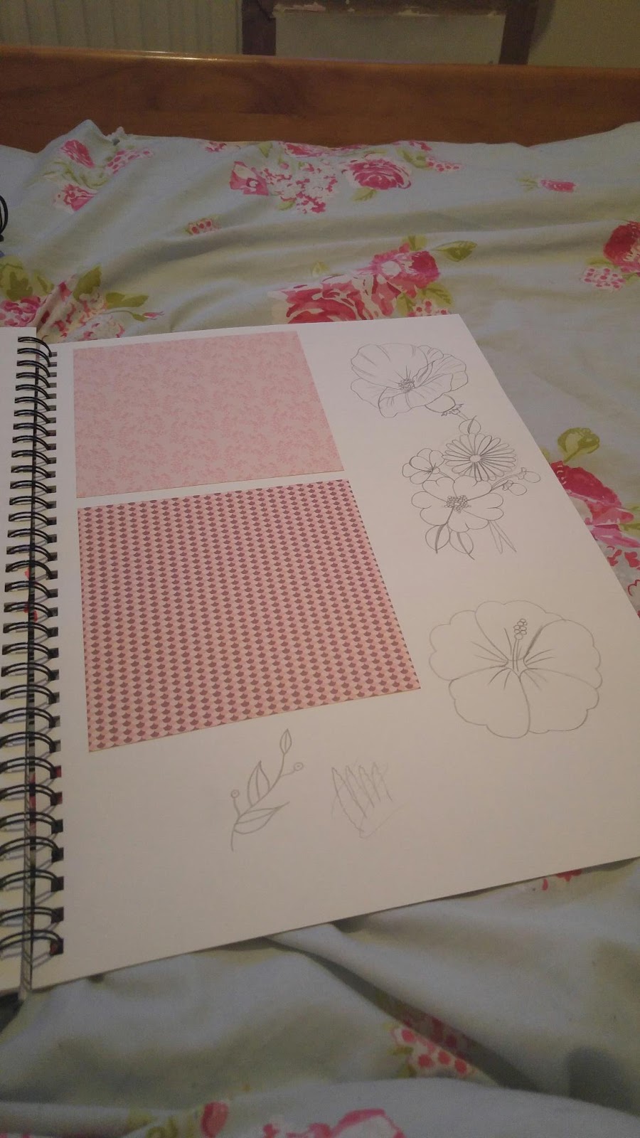
Alberto Vargas is a well known pin up artist who helped define the iconic image of pin up art. His work has a unique style which shows soft colours using light tones creating elegance and beauty in the female image, such as the porcelain type skin he uses for many of his models. His illustrations of the female body are much more accurate with the slight lines and creases which women of all sizes naturally have, although Vargas uses slim-build women as his models. Unlike othe pon up artists, Vargas deems to take his illustrative work close to realism with his incredible accuracy of the body and face. His art not only seems to push the boundary of pin u, but the standard of art in the 50s period alone. 
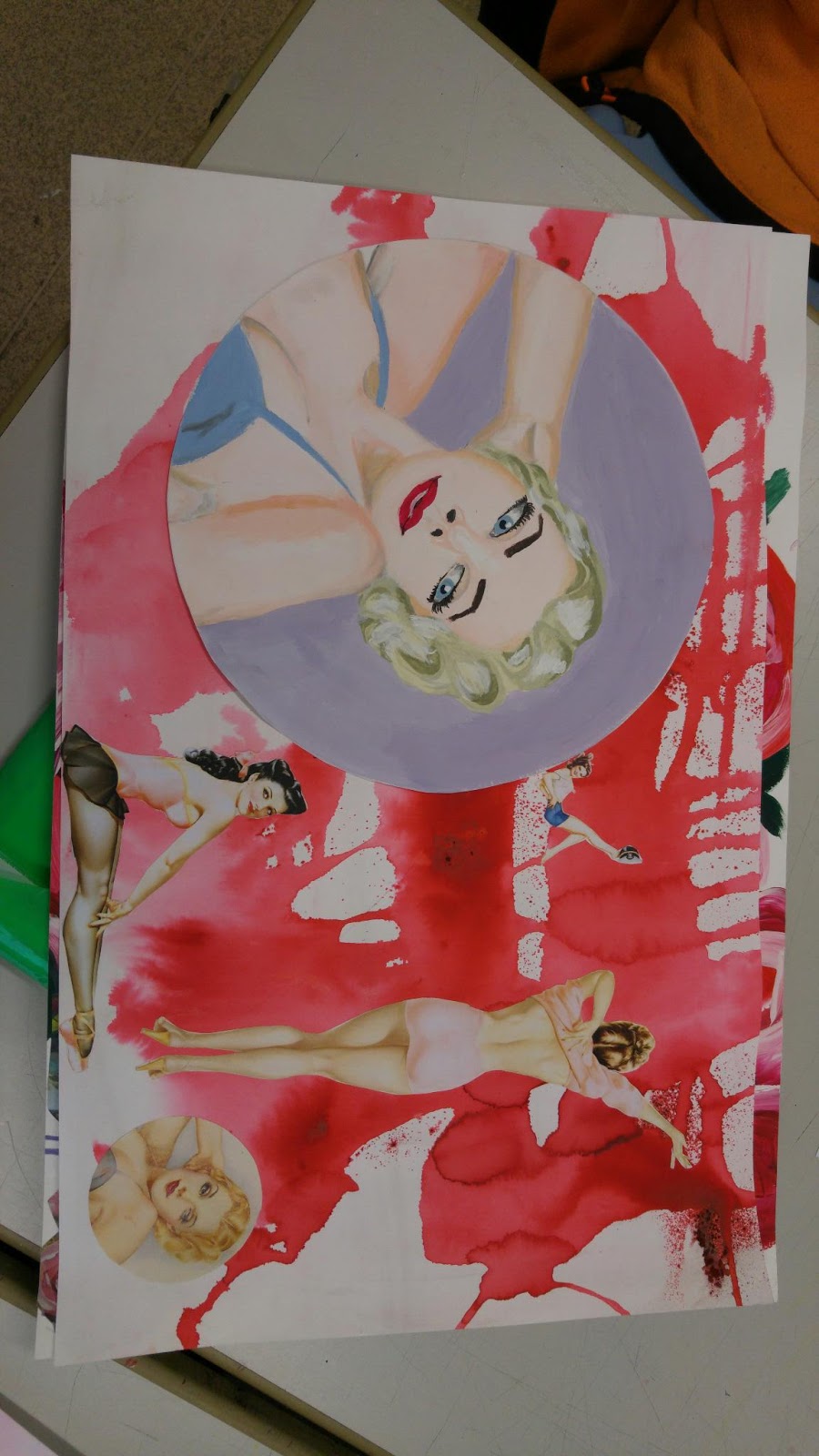
Vargas has created a very realistic piece of a red headed model.  She has a full shaped face and smooth detailed facial features, which are like that of an average woman, however, the smooth and soft looking pocelain skin is quite spot on and the shadowing/tones are perfect due to its simplicity. It seems to be relistic in these aspects, it is one of the best pin up pieces I have seen, hence why I have chosen to recreate it. There is a light glow radiating from just the face of the model and part of the chest throught the skin, using innocence as a key role showing slight cleavage. It is fascinating how Vargas has managed to create such beauty in an illustration and make it look natural. Many of his works are done in water colour and amazingly he manages neat lines, edges, shading and tones in this piece. From this piece I hope to capure the natural beauty Vergas has created. 
I believe my version of this piece takes a very similar shape to the vergas piece. The colours are soft like the original, however the shading is much sharper than the original piece, there could have been a much more smoother and blended style to it by creating shades from the original skin tone. It is quite realistic and correctly coloured. I believe that although the original is water colour I have done well in acrylic. The facial features don't look too rushed like I tend to do and the eyes are almost coreectly sized. The lips are well placed on the face and shaded correctly with nice highlights in two tones. The nose is good and it is one of the best I have done up to this point considering it's size, structure, and placement, I believe in the future I could develop it further by simply sketching to help my portraits be more accurate for my final pieces of work. Moving on to the hair, there isn't much smoothness or fine detail that Vargas shows in his work but the shape is quite similar to the original. I maybe need to work on being able to get small detail using a thinner brush. Maybe next time I could also try using water paints , which aren't my strongest point, to recreate his work, rather than acrylic.